
Sometimes the market reaches a point where neither buyers nor sellers have the upper hand. At such a moment, a candlestick forms that has no distinct body and looks more like a plus sign or a cross. If this candlestick appears in a bearish zone and in red color, it is referred to in the market as a Red Cross candlestick; a candlestick that has a simple appearance, but behind this simplicity, it hides an important message of pause, hesitation, and the market preparing for a new decision.
Beginners usually pass by such a simple candlestick, because they do not see any special movement in it. But someone who has observed the market for years knows that these moments of indecision often form just before significant moves; whether in the continuation of a decline or at the beginning of a reversal.
In the continuation of this article from MondFx, we examine exactly when this candlestick forms, how it differs from other candlesticks, and how, in practice, its message should be used in decision making.
An Introduction to Candlestick Analysis
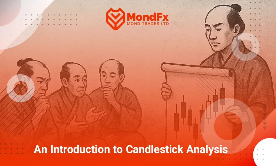
Centuries ago in Japan, rice traders used a unique method to predict price changes. They not only paid attention to numbers and simple charts, but also carefully examined their own emotions and behaviors, as well as those of others in the market. These traders, who mainly traded rice price fluctuations, intuitively concluded that price trends are not driven solely by economic and technical changes, but are largely influenced by market emotions and psychological reactions.
It was at this time that candlesticks entered the scene. One of the greatest pioneers of this method was Munehisa Homma; Munehisa Homma, who is also known as the father of price action, was a Japanese trader who, by using candlestick based charts, enabled other traders to predict price movements with greater accuracy just as today candlesticks allow traders to see, at a glance, all the information needed for decision making in the market: from open, close, high, and low prices to market sentiment, which is displayed through the shadows and bodies of the candlesticks.
Modern traders, just as rice traders in the eighteenth century paid attention to the emotions and behaviors of others, now use candlestick patterns such as Dojis, Engulfings, and Marubozus to simulate market sentiment and expectations.
Today, we use modern candlesticks and their patterns to identify potential trends, and we combine them with analytical tools such as moving averages, support and resistance levels, and indicators.
Everything You Need to Know About the Red Cross Candlestick!
The Red Cross candlestick (Gravestone Doji) is one of the well known and powerful patterns in technical analysis that usually appears at the end of an uptrend and is considered a reversal signal. This candlestick represents a point where buyers initially manage to push the price higher, but by the end of the trading period, sellers gain control and drive the price back to its opening level. The result of this movement is a candlestick with a very small or even unnoticeable body and a long upper shadow.
How the Red Cross Candlestick Forms
The Red Cross candlestick typically forms during a strong uptrend. At first, the price rises sharply and reaches its peak. Then, in the second half of the trading period, selling pressure begins and the price declines, eventually closing the candlestick with the closing price remaining almost equal to the opening price. As a result, the long upper shadow of the candlestick represents the maximum price reached during the trading period, but ultimately the outcome is pulled downward, indicating selling pressure.
Signs and Signals of the Red Cross Candlestick
The Red Cross candlestick is generally recognized as a bearish signal. This candlestick indicates that selling pressure in the market is increasing relative to buying pressure, and the uptrend may soon reverse. Since this candlestick appears near a price peak and has a short body, it can warn traders that market sentiment is changing and that it may be an appropriate time to open sell positions.
However, it should be noted that this candlestick alone is not sufficient, and to confirm this signal, further analysis or additional confirmation candlesticks are required.
Common Mistakes in Identifying the Red Cross Candlestick
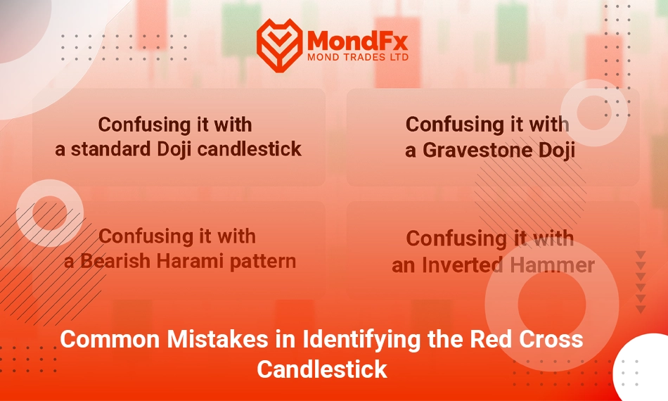
The Red Cross candlestick may be confused with several similar candlesticks. One of these is the Doji candlestick, which, like the Red Cross, has a small body, but its shadows are balanced and appear equally above and below the candlestick.
Whereas the Red Cross has a long shadow only on the upper side of the candlestick. The Gravestone Doji candlestick is also very similar to the Red Cross; however, in the Gravestone Doji, the opening and closing prices are exactly equal, and the long shadow appears only above the candlestick.
The Red Cross specifically appears at the end of an uptrend and indicates selling pressure.
Additionally, the Bearish Harami and the Inverted Hammer candlestick also share some similarities with the Red Cross, as they appear at the end of an uptrend and may signal a potential trend reversal. However, the Bearish Harami has a small body that is contained within the body of a larger candlestick, while the Inverted Hammer forms with a long upper shadow at the end of a downtrend.
Why Should We Pay Attention to the Red Cross Candlestick?
The Red Cross candlestick can be used as one of the most important tools for identifying trend reversals. This candlestick helps traders quickly recognize changes in the market and avoid incorrect moves during an uptrend. Of course, it should always be noted that this candlestick should not be used as a standalone decision making tool and must be analyzed alongside other signals and technical analyses.
Overall, the Red Cross candlestick is one of the key patterns in technical analysis that can help analysts and traders identify critical market points and make more precise trading decisions.
What are the advantages and disadvantages of the red cross candlestick?
One of the advantages of the Red Cross candlestick is its ability to anticipate market reversals. When this candlestick forms at a strong resistance level, it can be a sign of the potential start of a downtrend. On the other hand, this pattern can provide a good signal for traders who are waiting to enter the market based on price analysis.
However, the Red Cross candlestick also has certain drawbacks. The most important disadvantage is that this pattern alone cannot provide complete certainty about a change in the market trend. Since the Red Cross candlestick usually only reflects the current market condition and may, in some cases, produce false signals, traders need to combine it with other indicators and technical signals. In addition, in situations where the market is influenced by news or fundamental factors, the signal of this pattern may be disregarded and lead to unfavorable results.
Important Examples of the Red Cross Candlestick on Different Charts
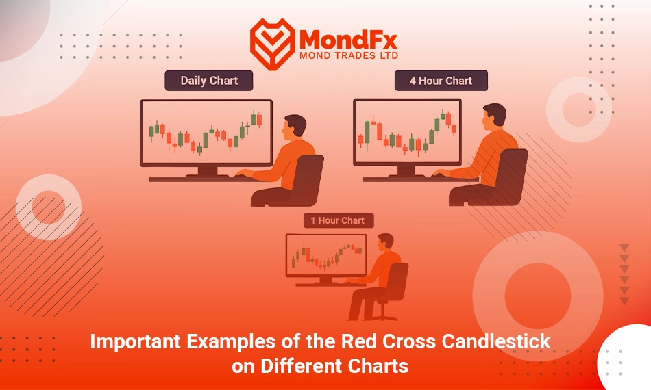
1) Red Cross Candlestick on the Daily Chart
Suppose an asset is rising to a price above $100, and then a Red Cross candlestick with a long upper shadow forms near the $102 level. This formed pattern can be a signal for a potential reversal of the price trend toward a bearish direction.
Therefore, at the end of a long uptrend, the Red Cross candlestick can indicate divergence and the probability of a trend change from bullish to bearish. The small body of this candlestick and its long shadows indicate resistance and selling pressure.
2) Red Cross Candlestick on the 4 Hour Chart
Suppose the price of an asset has risen from $50 to $55, and eventually a Red Cross candlestick forms at the $54 level. This pattern can indicate a decrease in buying pressure and the beginning of a price correction.
In this time frame, the Red Cross candlestick may signal a change in short term market movements. If this pattern forms at the end of a short term uptrend, the probability of a price correction exists.
3) Red Cross Candlestick on the 1 Hour Chart
If, for example, under conditions where the price of a cryptocurrency has risen from $300 to $320 and afterward a Red Cross candlestick forms at the $318 level, we can interpret this as the candlestick indicating the start of a short term correction in the market.
In this short term time frame, the Red Cross candlestick can be a sign of an immediate change in market behavior. This pattern at the end of a short term uptrend usually signals selling pressure.
Final Words
The Red Cross candlestick should not be considered a constant sign or a guaranteed confirmation of a market reversal; rather, it should be viewed as a warning bell for specific and sensitive price moments moments when the market, after an upward move, becomes hesitant about continuing its path and the balance of power between buyers and sellers begins to shift. This candlestick does not appear frequently on the chart, because its formation requires a real and serious battle in the market; a situation where buyers push the price higher, but sellers reclaim all of that growth within the same period.
For this very reason, when the Red Cross appears, it gains analytical value. What matters in using this pattern is understanding its position within the overall trend structure, support and resistance levels, and the behavior of other analytical tools. A trader who reads these signals together will make more precise, more logical, and lower risk choices instead of hasty decisions.
Frequently Asked Questions (FAQ)
Is the Red Cross candlestick alone sufficient for entering a trade?
No, the Red Cross candlestick should not be used as the sole basis for entering a trade, because this pattern only indicates hesitation and the possibility of a trend change, not a definitive signal. For more accurate decision making, this candlestick must be analyzed alongside tools such as support and resistance levels, trading volume, and indicators.
Under what conditions does the Red Cross candlestick have the most validity?
This candlestick has the highest validity when it forms at the end of an uptrend and near key resistance levels. Under such conditions, the likelihood of increased selling pressure and the beginning of a correction or trend reversal becomes higher.
What Is the Difference Between the Red Cross Candlestick and a Doji?
Both candlesticks have very small bodies, but the main difference lies in the position of the shadows. In the Red Cross candlestick, the shadow appears only above the candlestick and is long, whereas in a regular Doji, shadows usually exist on both the upper and lower sides.
Can the Red Cross Candlestick Be Used in All Markets?
Yes, this candlestick is not limited to a specific market and can be used in Forex, cryptocurrencies, stocks, and commodities. What matters is the conditions under which it forms and its position within the market trend structure, not the type of asset.
In Which Time Frame Is the Red Cross Candlestick More Reliable?
In higher time frames such as the daily and four hour charts, this candlestick is more reliable because it reflects the behavior of a larger group of traders. In lower time frames, market noise may result in weaker signals.
Should One Immediately Enter a Sell Trade After Observing a Red Cross Candlestick?
No, rushing into a trade can lead to losses. It is better to wait for confirmation from subsequent candlesticks, a break of support levels, or a decrease in buyer strength shown by indicators, and then make the final decision.